Services provided
WHAT
EXÁNT is a boutique real estate development company founded by a team of veteran industry specialists, operating across both residential (B2C) and commercial (B2B) sectors. Entering a highly saturated market dominated by established developers, the company approached us to build its brand from the ground up.
Our role spanned defining the organisation’s vision, mission, and values, as well as developing a clear positioning and value proposition across its dual offering. The challenge was not only to introduce a new name into a crowded category, but to establish immediate credibility while moving beyond the industry’s structural reliance on project-led marketing.
Visit website
Visit website


BRANDTYPE
Principled type brands pride themselves on having strict moral and ethical standards while providing trustworthy services in a transparent manner.
Discover brandtypes
Discover brandtypes
INSIGHT
Most developers compete on speed, scale, and visibility, treating location as a fixed input rather than something to be deeply understood. This leads to projects that satisfy demand but lack lasting relevance or connection to their surroundings.
The key insight was that location, when approached with patience and rigor, becomes the primary source of value. Not just where to build, but what can be uncovered through deeper exploration - revealing opportunities that are missed by more execution-driven players.
POSITIONING
We positioned EXÁNT as a developer defined by its depth of understanding rather than volume of output - applying a disciplined, exploratory approach to every project. This enables the brand to operate consistently across both residential and commercial contexts while maintaining a clear point of view.
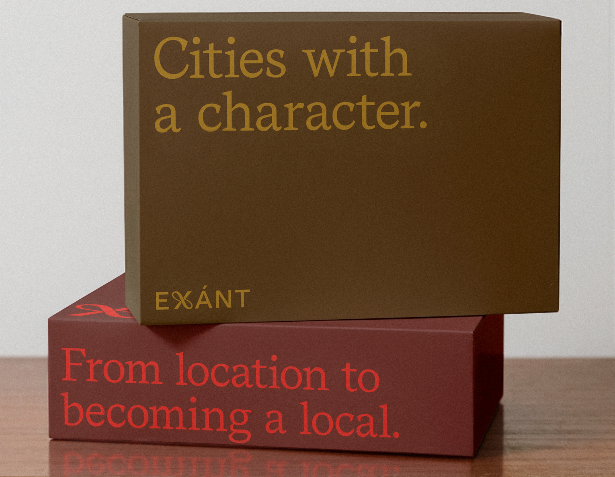
This strategy is expressed through two value propositions: in residential, EXÁNT moves from a location to a local, creating spaces that feel inherently connected to their surroundings; in commercial, it focuses on placing your business on the map, helping companies identify and establish their place within a broader landscape.


RESULT
The strategy translated into a brand identity that reflects both intellectual rigor and refined taste. The visual identity, developed by andstudio, draws inspiration from the worlds of art, museums, and curated exhibitions - framing each project as a considered composition rather than a commercial output.
At the center of the identity is the X symbol - representing the search for the unknown within each location and the moment that potential is uncovered. The stylized X mark reflects this idea of discovering a place’s defining factor, while its flowing form resembles a ceremonial ribbon being cut, symbolizing the opening of a new space.
This visual language is reinforced through a system inspired by gallery curation, where architecture, interiors, and people are presented as exhibits with context and intent. A structured grid and signature label element ensure consistency, while a palette of deep reds, golds, and marble tones introduces a sense of contemporary luxury.

TESTIMONIAL